🚧 Not yet live (coming soon). Tile Monster View isn’t available yet. It’s documented ahead of release, so what’s described below can still change before it ships.
🧪 Experimental feature (preview). This feature is under active development and released early so you can try it and give feedback. Behaviour, options, and results can change without notice, and it isn’t covered by the usual support and stability guarantees. Avoid relying on it for production work.
Overview
Tile Monster is a tile builder that lives where the data does. Switch any record list to it and you get an Excel-like grid: drag across a range of cells, drop a widget into the range you drew, bind it to one of the columns already in view, and tune it. The result is a small card that says something specific about a record — a name and a status pill, a hero number, an icon that changes with priority, a barcode seeded by the case reference.
What you design here doesn’t stay here. Tile Monster’s output is a plain JSON tile definition, and its companion, the Monster Tile, renders that definition on entity pages. The two share one renderer, so the tile you preview in the builder is exactly the tile users see.
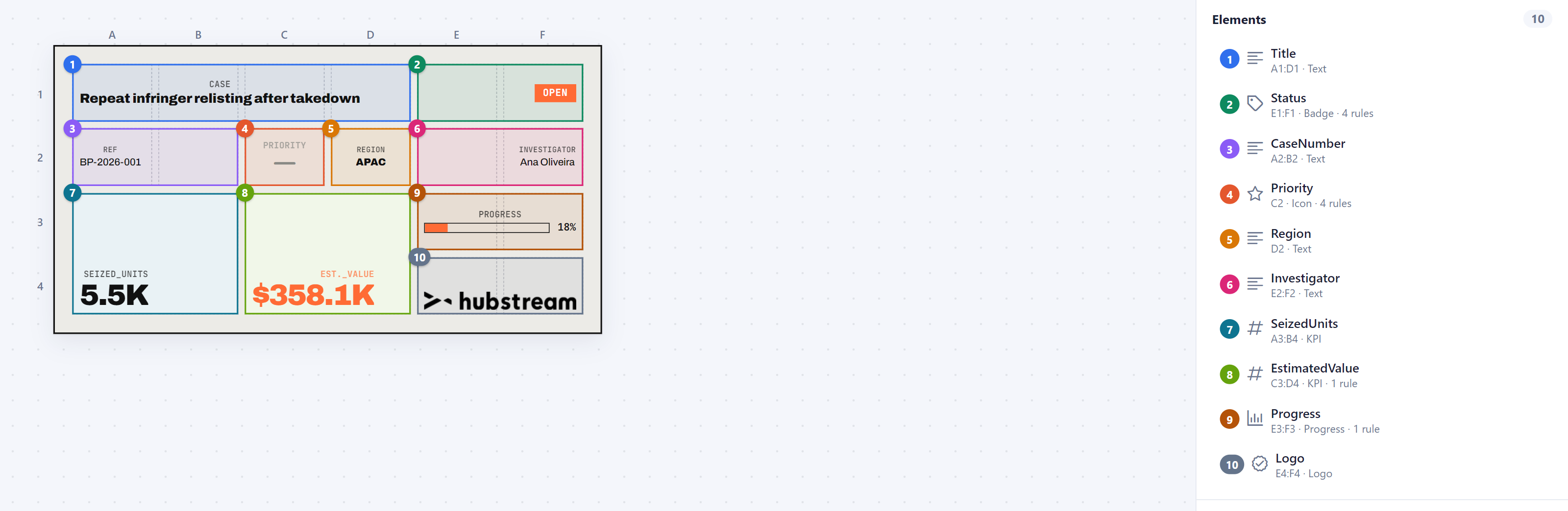
Where the controls are
Tile Monster’s controls sit in the page’s action bar — the row under the page title — not inside the view itself. The mode switcher is always on the right; the rest of the row changes with the view, so you only ever see controls that do something:
| Control | Design | Preview | JSON |
|---|---|---|---|
| Start from… — the starters | ✓ | ||
| Grid settings — columns, rows, aspect, colours, and start from an empty grid | ✓ | ||
| Canvas width — how wide the design canvas draws the tile | ✓ | ||
| Select all and the contextual actions | ✓ | ||
| New Tile / rule name (far left) — the rules built with Tile Monster for this record type; pick one to edit it, or delete it | ✓ | ✓ | ✓ |
| Save / Update — create a tile rule, or write back to the one you opened | ✓ | ✓ | ✓ |
| Design · Preview · JSON | ✓ | ✓ | ✓ |
The three views
| View | What it’s for |
|---|---|
| Design | The grid, the elements, and the inspector. This is where you build. |
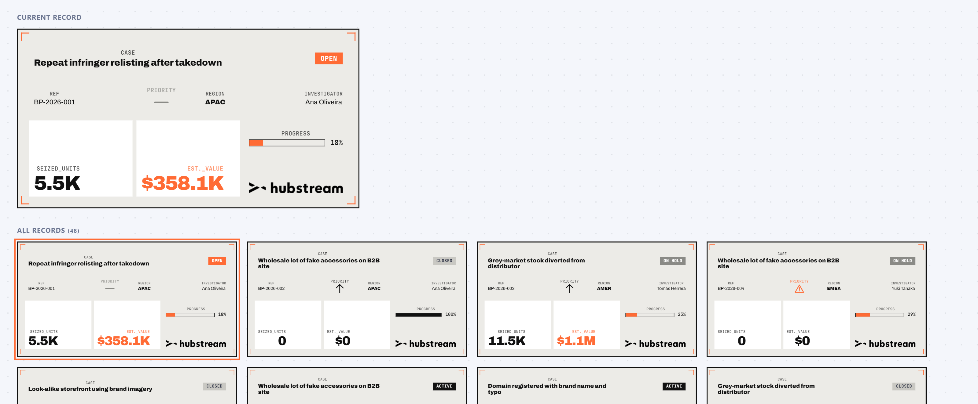
| Preview | The finished tile for the current record, plus a wall of every record in view — so you can see the design survive real data, not just the first row. |
| JSON | The definition as text. Also where you copy the Monster Tile payload. |
The Design grid and the Preview hero both draw one record at a time. Click any tile in the Preview wall to make it that record. Step through a few before you commit to a design: the row that reads beautifully is rarely the one that breaks it.
Building a tile
- Set the grid. The grid button in the action bar (it reads
6 × 4) opens columns, rows, aspect ratio, gap, padding, corner radius, background, border, text colour and decoration. A tile is a grid of equal cells — 6 × 4 is a good card, 5 × 2 a good strip. - Drag a range. Drag across empty cells. The range highlights; if it would overlap an existing element it turns red and won’t take.
- Pick a widget. The panel offers the ten kinds below. Choosing one creates the element and selects it.
- Bind and tune. The inspector sets the property, placement, alignment, size, caption, colours, and rules.
- Move and resize. Drag an element to move it; drag its bottom-right handle to resize.
Deleteremoves the selected one,Escdeselects.
Starters
The Start from… dropdown (in the action bar, while you’re in Design) gives you a running start.
Template (auto) is the default: it builds a tile out of the columns actually in view — a title line, a status badge, a couple of secondary facts, and any numbers it finds. It’s the only starter guaranteed to say something true about your records.
Everything else is a layout to edit rather than a finished tile:
| Template | Shape | Good for |
|---|---|---|
| Record card | 6 × 4, 1.9 : 1 | the general-purpose card — title, status, two hero numbers, a progress bar |
| Boarding pass | 10 × 4, 3 : 1 | a wide strip with a from → to pair, a few coded facts and a tear-off stub |
| Concert ticket | 8 × 5, 2.4 : 1 | one thing named loudly on a dark ground, with the details underneath |
| Postcard | 10 × 6, 1.45 : 1 | a note on the left, then a rule down the middle, a postmark, a stamp and address lines |
| ID badge | 6 × 8, portrait | a person: portrait slot, name, role, status, ID number, and an Assign button |
| Shipping label | 8 × 6, 1.3 : 1 | a big addressee and a big code, plus a tracking link built from the record’s own reference |
| Asset label | 6 × 6, 1.25 : 1 | a decor showcase: barcodes, halftone, crosshair |
| Portfolio summary | 6 × 3, 2.5 : 1 | aggregates across the whole result set rather than one record |
| Event strip | 5 × 2, 3.5 : 1 | a one-line event with an emoji marker |
| Action card | 6 × 5, 1.9 : 1 | the record plus what you can do to it — Edit and Assign buttons, and a link to open it |
| Contact card | 6 × 5, 1.8 : 1 | a person you contact: every link kind in one tile — email, phone, and the record |
| Trading card | 6 × 8, portrait | the loud one — a dark portrait card with a sparkle band and one big number |
The real-world layouts are borrowed on purpose: a boarding pass or a ticket stub is a shape everyone already knows how to read, and it gives the decor patterns an obvious job. Their field names (Origin, Venue, Seat…) are placeholders — every binding is automatically re-pointed onto a column of the same kind that exists on your page, so they arrive populated rather than full of dashes. Expect to re-pick a few fields; the layout is what you’re keeping.
The widgets
| Widget | Draws |
|---|---|
| Text | A property’s value, with an optional caption above it |
| KPI | A big number — the record’s own value, or a count / sum / average / min / max across the records in view |
| Badge | The value as a coloured pill |
| Icon | An icon chosen by comparison rules |
| Emoji | An emoji chosen by comparison rules |
| Sticker | An image from the Hubstream sticker service, fixed or chosen by rule |
| Logo | A brand logo |
| Progress | A numeric value as a bar against a maximum |
| Label | Static text — no data behind it |
| Decor | A generated ornament — 18 of them, in two families. Technical: barcode (and a vertical one), halftone dots, dot gradient, static noise, hatching, graph grid, crosshair, arrow, rule, solid block. Retro-futurist: sparkles, starbursts, wireframe globes, orbit rings, chevrons, square wave, ripples. All are drawn, not images, so they stay sharp at any size. Some vary with a bound property, so each record gets its own — the picker marks those. |
Rules — making a widget react
Every data-bound widget can carry an ordered list of rules. Each rule compares the bound property (or a different one, if you pick a Compare a different property) and, on the first match, contributes a colour, an icon or emoji, an image, or replacement text. Nothing matches? The default you set above the rule list is used.
Operators: = ≠ > ≥ < ≤ contains starts with is empty is not empty is true is false. Text comparisons ignore case; when both sides look like numbers they’re compared as numbers.
The inspector shows the current record’s value for the compared property, and highlights the rule that matches it — so you can step through records and watch the rule that fires change.
Rules compare the value a field holds, not its caption. For a value-list field like Status, write
Resolved, not the label it happens to display in your language.
House style
The tile itself is deliberately brutalist — paper or white, black ink, one orange accent, grey and light grey for de-emphasis, square corners, monospace uppercase captions, heavy tight numerals. Use the orange for the one thing that matters on the tile: an alert state, or the hero number. Keep the rest monochrome, and don’t put two heroes on one tile.
Nothing is measured in pixels. The tile fills whatever width it’s given and every length inside it — cells, gaps, padding, type — scales with that width, so the same design works as a 240px card and as a full-width banner.
Working with the records in view
- Selecting. Tick a tile in the Preview wall and it joins the page’s selection, exactly like ticking a row in the grid — the contextual action bar counts it and acts on it. Select-all works too.
- Opening. A tile’s name, or its → button, opens that record.
- How many records. The view fetches one page up to the Max Result Count For Tile Monster Viz setting (1000 by default). Past that a banner tells you the wall is showing the first N.
- Nothing in view. If the query returns no records, the Preview view offers to take you to related records that could feed the builder instead.
Buttons and links
Two of the widget kinds do something when pressed, rather than just showing a value.
Button runs one of the app’s own actions against the record the tile is sitting on:
| Action | What it does |
|---|---|
| New record | Opens the New form for a record type you choose (not linked to this one) |
| Add linked record | Opens the Add-Link form: a new record of that type, linked to this one |
| Edit this record | Opens the Edit form |
| Assign… / Refer… | Opens the app’s Assign or Refer dialog |
| Set a field | Writes a fixed value into a field — one press, no form |
These are the same actions as the record’s own action menu, so they open the same forms and the page updates the same way afterwards. Set a field is the one that writes immediately with no confirmation step, so choose its value deliberately.
Link shows text and goes somewhere: this record, a web address, an email, or a phone number. The text can
be typed, or read from a property. For a web address you can drop a value into the URL with braces —
https://track.example.com/{TrackingNumber} — and Tile Monster adds any field named that way to what the tile
fetches, so the link is built from real data.
Buttons and links never fire inside Tile Monster, in any of the three views. They are drawn exactly as they will ship, but pressing one here does nothing — otherwise laying out a tile would mean setting off real Assign dialogs. Try them on the record page.
If a button is not finished — no action chosen, or it points at a record type or field that does not exist — an orange strip says so and Save is disabled. An unfinished button still looks like a button on the record page, and the person who finds out it is dead can’t fix it.
When a field can’t be fetched
If the design binds something that isn’t a field on the record’s type, an orange strip appears above the workspace naming it, and Save is disabled until you re-pick it in Design.
This is worth taking seriously rather than working around. A tile that asks for a column the system doesn’t have doesn’t just fail quietly — it fails the whole request, and every tile on that record’s page stops loading with it. That is why the design cannot be saved while the warning is showing.
The usual cause is a design built on one record type and then pointed at another, where the field is named differently or doesn’t exist at all.
Changing a design you already saved
The first button in the action bar tells you what is on the canvas: New Tile when you’re designing from scratch, or the name of the saved rule you opened. Press it for the list of rules built with Tile Monster for the kind of record you’re looking at — on a Cases page you see the Case tiles, nothing else. Each row shows the rule’s name, the design’s name and where it shows (own page, linked pages, or Tile view); the one on the canvas is ticked, and New Tile at the top takes you back to a fresh starter.
Pick a rule and it loads into Design, exactly as it was saved. Change whatever you like — the design and where it shows — then press Update. It walks the same three steps as Save; only the name is fixed, because the rule and its stored design are keyed on it. Clear Cache to see the change on a record.
If you’d rather keep the original, Save as a new rule instead is on the last step.
Every row also has a trash icon. It asks Delete this ruleset? This is permanent. — and it means it: the rule, its conditions and its stored design all go. Clear Cache for the page to stop showing it.
Two things worth knowing:
- Moving to a page for a different record type gives you a fresh starter for that type. A design is built on one type’s fields; it doesn’t follow you to another.
- Loading a starter, or starting a new tile, lets go of the design you opened — the next Save creates a new rule rather than overwriting the one you were editing.
Saving a design as a tile
Save turns the design into a real Monster Tile rule, without a trip to the rule admin. It’s three short steps:
- Name it. Letters and digits, automatically prefixed
TM; a description, a sequence, and whether it’s enabled. If the name is already taken, the dialog says so and shows the name it will actually use (TMCaseCard2) before you commit — it never quietly creates a duplicate. - Where it shows. This will create a Case tile called TMCaseCard. Then one choice:
- On their own page — an insight tile on each record’s own page.
- On pages that link to them — an insight tile on the pages that link to the record, optionally only on some page types.
- In the Tile view, as the body of their card — your design becomes the body of the record’s card in the Tile view; the card keeps its checkbox, its footer buttons and its counts. For the two insight shapes you can also hide the tile when there’s no record to draw.
- Summary. Everything the rule will be, laid out for review before anything is written.
Saving creates the rule immediately. Clear the cache and open a record (or the Tile view) to see it. Nothing else is touched: no existing rules change, and no model update is needed.
Handing the design to a Monster Tile by hand
Switch to the JSON view. It shows the whole config object a Monster Tile expects — the design plus a Fields list derived from it, so the tile fetches exactly the columns the design reads. Select it and copy, then paste it into the Monster Tile rule’s config in the admin. See Monster Tile for the rest.
This is also the shape to hand an AI assistant if you’d rather describe a tile than draw one. Paste what it writes back into the editor and press Apply, the view’s only button — which understands either the whole payload or just the design part on its own.
Two of the values are worked out for you rather than read: Fields and EntityName come from the design and the records in view, so editing them here has no effect. Apply says so if you try.
Limits
- Starting from nothing is at the bottom of the grid-settings popover (Start from an empty grid).
- Designs aren’t saved. The builder has no library and no autosave: you design, you copy the JSON, you paste it into a tile (or download it). Reloading the view starts fresh.
- Aggregates mean “the records in view”. A KPI set to Sum over records adds up the whole page here. On a Monster Tile, which normally fetches the one record it sits on, the same widget describes that record alone. The inspector warns you when a design picks an aggregate.
- Elements can’t overlap. Ranges behave like merged spreadsheet cells.
- The grid caps at 24 × 24.