Overview
The Big Button Tile puts one action one press away. It’s a single, large, tactile button on the record’s page — a glossy red dome, an arcade cap, a giant keycap, a neon orb, a full-tile CTA, a printed cargo-label plate, or a plain quiet button — and pressing it runs one configured action on the record you’re looking at: open a form, assign the case, refer it, or set a status.
The action goes through the app’s own action pipeline — the same route as the record page’s action menu. The button opens the same forms and the same dialogs, respects the same permissions, and refreshes the page the same way afterwards. It’s a shortcut, not a side door.
easy style as an "Add a file" button — no card behind it, just the button on the page. One tap opens the standard upload dialog, parented to the record in view.How it behaves
- Tap, or hold to press. With
HoldToPressMsset, a tap does nothing — you hold the button while a ring (or a sweep, on the flat, dataspace and basic styles) fills, and it fires only when the fill completes. Let go early and it drains harmlessly. Use it as the safety on consequential buttons. - The button only arms when it can actually work. The configuration is checked against the model, the action against your permissions, and the record must be in view. If anything fails, the button greys out and a line underneath names the reason — it never looks alive and then errors.
- Field writes give the standard feedback. A
SetField-style press shows the app’s own “updated” message and reloads the page data; form and dialog actions open the standard modal. - It knows when the work is already done. For a field-writing button, also fetch the target field (add it to
Fields) and setDoneValuesto every value that means “finished”. A case that’s already Resolved shows a disarmed button readingDoneLabel(“Closed”) with “This case is already closed” underneath — and a successful press flips the tile to that state by itself when the page data reloads.
The actions
Action is a platform action name. Six are supported:
Action | On press | Also needs |
|---|---|---|
AddEntity | Opens the New form for TargetEntity (a new, unlinked record) | TargetEntity; optional FormName |
AddLink | Opens the Add-Link form: a new TargetEntity linked to this record | TargetEntity; optional FormName |
EditEntity | Opens the Edit form for this record | optional FormName |
Assign | Opens the Assign dialog for this record | — |
Refer | Opens the Refer dialog for this record | — |
EditField | Writes TargetValue into TargetField on this record | TargetField, TargetValue; optional DoneValues + DoneLabel for the already-done state |
Opening a specific form
By default, the three form actions open the record type’s default New, Add-Link or Edit form. To open a different form, set FormName to that form’s name:
{ "Action": "EditEntity", "FormName": "CaseTriageEditForm" }- Leave
FormNameout (or empty) for the default form. FormNameonly works withAddEntity,AddLinkandEditEntity. On any other action the button greys out and says so.- For
AddEntityandAddLink, the form belongs to the new record’s type (TargetEntity), not the record in view. - The name isn’t checked before the button arms. A misspelt name only shows up when the form opens, so press each new button once after configuring it.
Assign and Refer open the standard dialogs on purpose. A button that silently assigned a case to someone — with no reviewer, no note — would be worse than the menu it replaces. The dialog is the action; the button puts it one press away. Configure them only on record types whose page menu offers Assign/Refer.
The configuration shape
Everything is edited as JSON on the tile’s rule, in the admin. Changes take effect after a cache clear — no deployment, no downtime.
{
  "Fields": ["ID", "Name", "GUID", "Status"],
  "UIProperties": {
    "EntityName": "Investigation",

    "Action": "EditField",
    "TargetEntity": "",
    "TargetField": "Status",
    "TargetValue": "Resolved",
    "DoneValues": ["Resolved", "Inconclusive"],
    "FormName": "",

    "ButtonStyle": "flat",
    "Icon": "check-circle",
    "Color": "",
    "LabelColor": "",
    "HoldToPressMs": 800,
    "Theme": "dark",
    "Disabled": false
  },
  "StaticContent": {
    "Label": "Close case",
    "DoneLabel": "Closed",
    "AlreadyDoneMessage": "This case is already closed.",
    "PlateText": "HUBSTREAM · CASE ACTIONS",
    "NoDataMessage": "There is no record to act on.",
    "NotPermittedMessage": "You don't have permission for this action.",
    "NotConfiguredMessage": "This tile is not configured correctly: {reason}",
    "ActionFailedMessage": "The action could not be completed. Try again."
  }
}
Look & feel
| Key | Meaning |
|---|---|
ButtonStyle | Which of the seven looks the button uses — see the table below |
Icon | Glyph shown above the label, from the app’s icon set (the hub-icon- prefix is optional). Empty = label only |
Color / LabelColor | CSS colour overrides for the style’s accent and label. Empty keeps each style’s own colours |
HoldToPressMs | 0 = a tap fires. Above zero = hold that long to fire |
Theme | dark or light, to match the page behind the tile — it picks the label ink and the weight of the button’s own shadow. On dataspace it also picks the plate stock (charcoal vs the Hubstream tan) |
Disabled | The tile stays visible but inert and desaturated |
Label | The face text. Omit it for the style’s own word (easy, GO, ENTER, Press, PUSH, EXECUTE, Continue) |
PlateText | dataspace style only: the microcopy band across the top of the plate |
Button styles
ButtonStyle | Looks like |
|---|---|
easy | A glossy red dome on a silver base |
arcade | A convex cap in a chrome bezel |
keycap | One giant mechanical key |
flat | A modern CTA that fills the tile |
glow | A neon orb |
dataspace | A printed cargo-label plate |
basic | Just a button — a quiet, neutral surface with a hairline border and generous padding. No gradients, no uppercase; the calm choice for everyday actions |
Every style sits straight on the page with no card behind it — just the button. On dataspace, the theme picks the print stock: dark is cream ink on the charcoal plate, light prints charcoal ink on the Hubstream tan.
Here’s the range — five of the styles, each from a real configuration:
easy style with "Label": "Add a file" and no Icon — the dome carries the label on its own.
flat style fills the whole tile — here as an Assign button, so one press opens the standard Assign dialog.
glow style on "Theme": "dark" — a neon orb with an Icon above the label.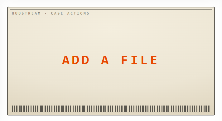
dataspace style on "Theme": "light" — charcoal ink on the Hubstream tan. The top band is PlateText.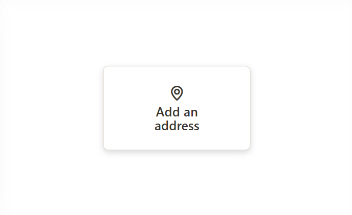
basic style — just a button, with generous padding and no shouting. Here as an AddLink to Address: one tap opens the linked-record form for the case.Examples
Close the case, with a hold-to-press safety
{ "Action": "EditField", "TargetField": "Status", "TargetValue": "Resolved",
  "ButtonStyle": "flat", "Icon": "check-circle", "HoldToPressMs": 800 }
with "Label": "Close case", "DoneLabel": "Closed" and "Status" in Fields. TargetValue is the status’s stored value, not its display caption. DoneValues: ["Resolved", "Inconclusive"] covers both endings, so the button doesn’t offer to “close” an inconclusive case — either way it reads Closed and disarms.
New task on this case
{ "Action": "AddLink", "TargetEntity": "Task",
  "ButtonStyle": "dataspace", "Icon": "plus-circle" }
with "Label": "New task" and "PlateText": "HUBSTREAM · CASE INTAKE". The Add-Link form opens with the new task already linked to the case.
Triage edit, not the full edit form
{ "Action": "EditEntity", "FormName": "CaseTriageEditForm",
  "ButtonStyle": "basic", "Icon": "edit" }
with "Label": "Triage". One press opens the short triage form instead of the case’s full Edit form.
Assign this case
{ "Action": "Assign", "ButtonStyle": "arcade" }with "Label": "ASSIGN". One press opens the standard Assign dialog.
Common gotchas
TargetValueis the stored value, not the caption. A value the field’s list doesn’t contain is rejected when the write lands — that’s the platform validating, not the tile failing.- Don’t point
EditFieldat a lookup field (one whose values are other records, like an owner). Only an exact target value would save. UseAssignfor ownership. AddLinkneeds a linkable child. The target must be a record type that can be linked to the record in view; the tile checks and says so if not.- A greyed button always says why. Read the line under it — it names the config key, the permission, or the missing record.
FormNameis the one setting the tile can’t check. A wrong form name doesn’t grey the button out. It only shows when the form opens, so test the press.- More buttons = more rules. Each Big Button on a page is its own rule with its own JSON; they all share one tile type.